
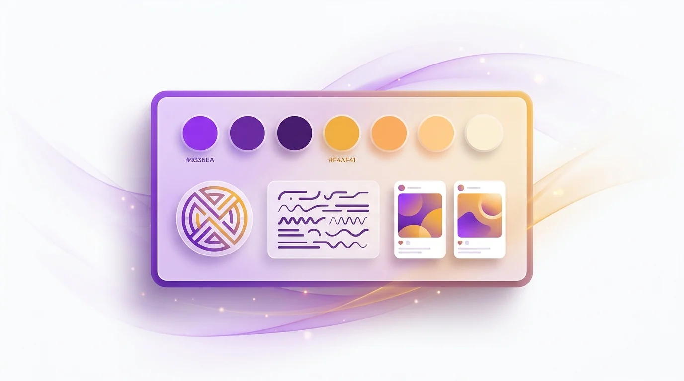
How to Create a Brand Kit (and Keep Every Post On-Brand) With AI
What a brand kit is, what belongs in it, and how to build one fast with AI so every social post stays on-brand, including generating a brand kit straight from your website.
What Is a Brand Kit (and Why It's Not Just a Logo)
A brand kit is the compact set of rules and assets that defines how your brand looks and sounds everywhere it appears: logo variations, a color palette, typography, voice and tone, imagery rules, and a short list of do's and don'ts. It is smaller than a full brand book but big enough to keep every post, ad, and landing page consistent. If you have ever opened a folder full of slightly different logos and three shades of "the blue" that nobody can agree on, you already understand why a brand kit matters.
Here is the part people skip. Building a brand kit once is easy. Applying it across hundreds of posts, every week, without a designer checking each one, is the hard part. That is where consistency quietly dies. This guide does three things in order: it defines a brand kit and its components, it shows you how to build one fast, and then it shows you the modern shortcut, which is generating your brand DNA directly from your website URL so the kit applies to every visual automatically.
The audience for this is founders, freelancers, and small teams who need brand consistency at speed and do not have a creative department to enforce it. If that is you, the goal is not a 60-page guideline document that lives in a drawer. The goal is a tight, usable kit and a system that keeps you on-brand by default.
The Core Components of a Brand Kit
Most brand kits, whether they belong to a two-person startup or a global company, contain the same six building blocks. The difference is rigor, not structure. Below is the working reference you can copy. Each row pairs the element with what you actually need to define and a concrete example, so there is no guessing about the level of detail.
| Element | What to define | Example |
|---|---|---|
| Logo | Primary, secondary, icon/mark, and monochrome versions; clear-space and minimum size; where each variant is allowed | Full wordmark for headers; standalone icon for profile avatars and favicons; white mono version for dark backgrounds |
| Color palette | Primary, secondary, accent, and neutral colors with exact HEX/RGB values and a role for each | Primary #1E3A8A (deep blue), Accent #F59E0B (amber), Neutrals #0F172A / #F8FAFC; blue for headlines, amber for CTAs only |
| Typography | Heading and body typefaces, weights, sizes/scale, and web-safe fallbacks | Headings: Inter Bold; Body: Inter Regular 16px; fallback: system-ui, sans-serif |
| Voice and tone | 3 to 5 voice adjectives plus how tone shifts by context (launch vs. support vs. error) | Voice: confident, plain-spoken, warm. Tone: upbeat on launches, calm and reassuring in support replies |
| Imagery rules | Photography vs. illustration, mood, color treatment, subject framing, and what to avoid | Bright natural-light product photos on clean backgrounds; no stock-photo handshakes; duotone overlay in brand blue |
| Do / Don't | Explicit guardrails that prevent the most common misuses | DO keep the logo on solid backgrounds; DON'T stretch it, recolor it, or place it on busy images |
The table looks tidy, but each element hides a few practical decisions. Let's break the six into the visual half and the often-skipped half.
Logo, Color, and Typography: The Visual Foundation
The visual triad is logo, color, and type. Get these three right and your content is recognizable from a thumbnail.
Your logo is rarely one file. A usable kit ships at least four variants: a primary lockup, a secondary or horizontal version, a standalone icon or mark for avatars and favicons, and a monochrome version for low-contrast situations. Define clear-space (how much empty room surrounds it) and a minimum size so nobody shrinks it into a blur. Note where each variant is allowed.
Your color palette is more than swatches. Assign a role to each color. A primary HEX value, a secondary, one accent reserved for calls to action, and a small set of neutrals for text and backgrounds. Use exact HEX and RGB values, not "the orange." Color carries real weight here. According to a Reboot Online study citing research from Loyola University Maryland, a signature color can lift brand recognition by up to 80%. Separately, the Institute for Color Research is widely cited for the finding that around 85% of consumers name color as a primary reason they buy a particular product. Picking and locking your palette is not decoration, it is recall.
Typography is the third leg. Choose a heading typeface and a body typeface, define the weights you actually use, set a size scale, and list a web-safe fallback stack so the design does not collapse when a font fails to load. Two typefaces used consistently beat five typefaces used randomly every time.
Voice, Tone, and Imagery Rules: The Often-Skipped Half
Most DIY brand kits stop at the colors. That is a mistake, because half of how a brand feels is non-visual. Voice and tone and imagery rules are what stop your captions from sounding like a different company wrote each one.
Voice is your personality, and it should be stable. Pick 3 to 5 adjectives, for example confident, plain-spoken, and warm. Tone is how that voice flexes by context. You are upbeat on a launch, calm and reassuring in a support reply, and clear and brief in an error message. Writing this down means a freelancer or a teammate can match it without reading your mind.
Imagery rules govern the look of every picture you publish. Decide between photography and illustration, set the mood, define the color treatment (a duotone overlay in your brand blue, say), describe how subjects should be framed, and list what to avoid. "No stock-photo handshakes" is a real and useful rule. This is also the section that AI image generation cares about most, because it is the instruction set you want injected into every prompt. We will come back to that.
How to Build a Brand Kit Step by Step
If you are wondering how to create a brand kit from scratch, here is a sequence you can finish in an afternoon. Do it in this order, because each step constrains the next.
- Audit existing assets. Gather every logo file, screenshot, deck, and past post. Note what already looks consistent and what does not. You are starting from your real brand, not a blank page.
- Lock your colors. Pull the HEX values you already use most, cut the palette down to a primary, a secondary, one accent, and two or three neutrals, and assign each a role.
- Pick your type. Choose one heading and one body typeface with clear fallbacks. If you are unsure, a single well-set sans-serif used in two weights is plenty.
- Write voice guidelines. Three to five adjectives, plus two or three lines on how tone shifts by context. Keep it short enough to remember.
- Set imagery rules. Photography or illustration, mood, treatment, framing, and a short "never do this" list.
- Document do's and don'ts. Capture the misuses you have already seen. Stretched logos, off-palette colors, busy backgrounds.
- Ship a one-page reference. Put all of the above on a single page or slide. If it does not fit on one page, it is a brand book, not a kit, and people will not use it.
If you only have 30 minutes, the minimum viable brand kit is three things: a locked color palette with roles, one type pairing, and three voice adjectives. That alone removes most of the inconsistency from your content. You can layer in logo variants and imagery rules later.
Brand Kit Template: A Starting Checklist
You do not need a fancy brand kit template to get started. You need a checklist you fill in. Copy this structure and replace each placeholder with your real values. It maps one to one with the components table above.
- Logo: primary file, secondary file, icon, mono version, clear-space rule, minimum size
- Color palette: primary HEX, secondary HEX, accent HEX, neutral HEX values, and the role of each
- Typography: heading typeface and weight, body typeface and size, fallback stack
- Voice and tone: 3 to 5 voice adjectives, tone-by-context notes
- Imagery rules: photography vs. illustration, mood, color treatment, framing, avoid list
- Do / Don't: a short bulleted list of guardrails
Fill those six fields and you have a real, usable kit. The next question is whether you should type all of this by hand at all.
The AI Shortcut: Generate Your Brand Kit From a URL
Here is the modern angle. You probably do not need to build a brand kit from a blank document, because most of it already exists on your website. AI branding tools can read what you have already published and assemble the kit for you.
An AI brand kit is a brand kit that is generated and applied by an AI system rather than hand-assembled in a design tool. Instead of opening a color picker and squinting at your homepage, you point a tool at your URL and let it do the extraction. This is the fastest honest answer to "how do I create a brand kit quickly."
SparkFrame is the worked example here, and it is in beta, so treat this as one strong option rather than the only way. You paste your website URL, and in roughly 15 seconds it scrapes your homepage and pulls out your brand DNA: your colors, your voice and tone, your target audience, your products, your logo, and your founders. It turns that into a brand preset, with one preset for your light theme and one for your dark theme. The point is not that it replaces your judgment. The point is that it gives you a usable starting kit in seconds instead of an afternoon, and you can refine from there.
Brand DNA, in this context, is the structured profile of those extracted attributes. It is what makes the next part work, because once your brand is captured as data, it can be reused automatically on every image you generate.
Inside the Brand-DNA-From-URL Pipeline
It helps to see the stages. The pipeline is linear, and each stage produces something the next stage uses.
Stage one is the URL. You paste it. Stage two is the scrape, which reads your homepage in about 15 seconds. Stage three is extraction, where the system identifies your color palette, your voice and tone, your audience, your products, your logo, and your founders. Stage four builds the preset, packaging that brand DNA into a reusable profile split across a light and a dark theme. Stage five is the part that actually saves you time week after week: that preset gets injected into every image prompt you run.
Each stage is doing a job a person would otherwise do by hand. The extraction stage is your color-picking and voice-writing. The preset stage is your one-page reference. The injection stage is the design reviewer who would normally catch off-brand work before it ships.
Enforcing Your Brand Kit Automatically on Every Post
This is the section that actually matters, because a brand kit nobody applies is just a document. The real problem is drift. Post number 4 looks right. Post number 140, made in a hurry on a Friday, drifts off-palette and uses the wrong tone. Multiply that across a year and your feed looks like five different brands.
The data backs up how common this is. Lucidpress (now Marq) reports in its State of Brand Consistency research that while around 95% of organizations have formal brand guidelines, only about 25% enforce them consistently. Most brands have a kit. Few actually apply it. Enforcement, not creation, is the bottleneck.
The fix is to make consistency the default instead of an act of willpower. When your brand DNA is injected into every generation automatically, you do not have to remember the rules, because the rules are already in the prompt. In SparkFrame that injection applies across all 80 templates and all three content modes, so a Storytelling post, a Value Post, and a Creative Ad all pull from the same brand preset. You are not re-entering your colors each time.
Automatic does not mean blind. SparkFrame's creative director AI works human-in-the-loop by default. The agent proposes image-generation tool calls in a sidebar, and you review, edit, or approve them before anything is generated. If something still drifts, per-image conversational editing lets you nudge it back with plain language, like "make the colors more vibrant" or "use the darker background." So the kit is enforced by default, and you keep the final say. That combination, automatic application plus a human checkpoint, is the practical way to stay on-brand at volume without a designer reviewing every asset. For more on building a repeatable content pipeline this way, see our AI content creation guide.
Why Brand Consistency Pays Off
Brand consistency is not a vanity metric. It maps to revenue, and the numbers are well documented. According to the Lucidpress (now Marq) State of Brand Consistency report, consistent brand presentation across all platforms increases revenue by an average of 23%. A later edition of the same study, run with Demand Metric, found that consistent branding can lift revenue by as much as 33%, a 10-point jump over the earlier figure.
Why does consistency move money? Two reasons. First, recognition compounds. A widely cited marketing benchmark, attributed to Pam Moore, holds that it takes 5 to 7 brand impressions before someone remembers a brand, which means inconsistent presentation effectively resets the counter each time. Second, first impressions form almost instantly. Research by Lindgaard and colleagues, published in Behaviour & Information Technology in 2006, found that people form a first impression of a visual presentation in about 0.05 seconds. You do not get a second pass at that half-tenth of a second, so every asset needs to look like you.
There is also a velocity angle. Content teams publish a lot. Industry content-velocity benchmarks suggest a majority of marketers create more than five branded assets per week. The more you publish, the more chances there are to drift, and the more a default-on brand kit earns its keep. If you are trying to grow output without growing headcount, our piece on scaling content without a design team covers the workflow side in depth.
Agencies: Onboard a Client Brand in 15 Seconds
If you run an agency or freelance for multiple clients, the brand-DNA-from-URL approach changes onboarding. Normally, setting up a new client means collecting their brand book, hunting for HEX values, downloading logo files, and rebuilding a kit before you can produce anything. That can take a day. Sometimes the client cannot even find their own guidelines.
With a URL-to-brand-kit flow, you spin up a client's brand kit from their website during the kickoff call. Paste the URL, get a preset in about 15 seconds, and you are producing on-brand drafts before the call ends. Because SparkFrame stores a preset per brand, you switch between clients by switching presets. Client A's posts pull Client A's palette and voice, Client B's pull theirs, and nobody has to remember which blue belongs to whom.
This is the difference between managing brand consistency manually across a roster and having it handled by default per client. For agencies producing ad creative at volume, our guide on making AI ad creatives without a designer pairs naturally with this multi-client setup.
Brand Kit vs Brand Guidelines vs Style Guide
People use these terms interchangeably, which causes confusion, so here is a clean separation.
A brand kit is the practical, ready-to-use bundle of assets and short rules you reach for daily: logo files, palette, type, voice notes, imagery rules. A style guide usually refers to the rules layer specifically, often focused on visual or editorial standards. Brand guidelines, or a brand book, are the longer strategic document that explains the reasoning, the positioning, and the edge cases behind those rules.
For most founders and small teams, a tight brand kit is enough to ship consistent content. You graduate to full brand guidelines when you have a larger team and need to document the "why" so that decisions stay aligned without you in the room.
From Brand Kit to Published Post: Putting It Together
The whole arc is three moves. Define your brand kit (the six components in the table), build it fast (the seven-step workflow, or the URL shortcut), and then enforce it automatically so consistency is the default rather than a chore. The first two are well understood. The third is where most brands fall down, and it is the one AI actually solves, by injecting your brand DNA into every generation and keeping a human checkpoint in the loop.
In SparkFrame, that kit flows straight into producing on-brand visuals across all three modes: Storytelling, Value Posts, and Creative Ads. Worth knowing on cost: the agent's thinking, template filling, and web research cost zero credits. Only the actual image generation draws from your credit balance, so planning and refining your brand setup does not burn through anything.
If you want to see your brand kit appear in about 15 seconds, try SparkFrame on your free signup credits, paste your URL, and watch it pull your colors, voice, products, logo, and founders into a usable preset. Build the kit once, then let it apply itself to everything you publish.
Sources and further reading
- Study: consistent branding can increase revenue up to 33 percent (PR Newswire): the Lucidpress State of Brand Consistency findings.
- Marq: brand consistency as a competitive advantage: updated guidance from the team behind the original study.
Frequently asked questions
What is a brand kit?
A brand kit is the compact set of rules and assets that defines how your brand looks and sounds everywhere it appears: logo variations, color palette, typography, voice and tone, imagery rules, and do's and don'ts. It is smaller than a full brand book but enough to keep every post, ad, and page consistent.
What should a brand kit include?
At minimum: logo files and usage rules, a color palette with exact HEX/RGB values and roles, heading and body typefaces, a short voice-and-tone guide, imagery rules, and a do/don't list. Those six elements cover the vast majority of day-to-day content decisions.
How do I create a brand kit quickly?
Audit your existing assets, lock your colors and type, write 3 to 5 voice adjectives, set imagery rules, and document do's and don'ts on a single reference page. The fastest route is to let an AI tool extract your brand DNA from your website URL. SparkFrame builds a usable kit from your homepage in about 15 seconds.
Can AI build a brand kit from my website?
Yes. SparkFrame scrapes your homepage and extracts your colors, voice and tone, target audience, products, logo, and founders, then turns them into a brand preset (one for light, one for dark). That preset is injected into every visual it generates, so output stays on-brand automatically.
What's the difference between a brand kit and brand guidelines?
A brand kit is the practical, ready-to-use bundle of assets and short rules you reach for daily. Brand guidelines (or a brand book) are the longer document explaining strategy, rationale, and edge cases. For most founders and small teams, a tight brand kit is enough to ship consistent content.
How do I keep every post on-brand without a designer?
Do not rely on willpower, enforce the kit automatically. When your brand DNA is injected into every generation, consistency is the default. SparkFrame applies your brand preset across all 80 templates and lets you review or refine each image ("make the colors more vibrant") before it is final.
Related Posts
AI Product Photography: Studio-Quality Shots Without a Studio
A practical guide to AI product photography: when AI product photos work, the reference-and-restyle workflow, prompt ideas by shot type, and how to QA before you ship.

AI Thumbnail Maker: Click-Worthy YouTube Thumbnails Fast
How an AI thumbnail maker helps you create click-worthy YouTube thumbnails in minutes: the CTR drivers that matter, a step-by-step workflow, and the mistakes to avoid.
The Best AI Marketing Tools in 2026 (By the Job)
An opinionated, vendor-neutral guide to the best AI marketing tools in 2026, organized by the job each one does, with real pricing and a build-your-stack table.